How to see the data?
If the data is numeric, and it represents some series, it will be mostly represented with a graph of some sort. There are hundredths types of graphs available, and they all have some purpose, otherwise they would not exist.
However, for some special occasions, you have to see different kind of data.
The problem (this particular instance)
Since I am developing a internet media streaming CAPTURE and ARCHIVE application (StreamSink) I am also continuously testing it on one of my servers. I am adding channels, removing them, stopping the server, sometimes something goes wrong and the whole thing freezes or crashes, so the archive I have is rather heterogeneous in quality.
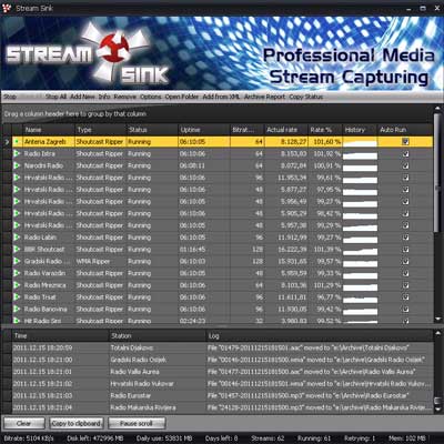
Let me go through the operational view – the mere GUI of the StreamSink, so I can present some problems and solutions so far.
Several things were important to the operator of the software that had to be present on the main (status) screen. For example:
- whole list of channels should be visible
- channel status should be visible at first glance
- I am interested what happened to the system recently
- I need to know the status of my connection
- it would be good to know how many disk space is available
I could dwell on it but the main point of this post is something else.
The problem here is that I had to create PlayKontrol report for a demonstration purpose (for them: http://ihg.hr/), that would scan 7 days of the archive (multiple channels, of course), and produce the reports (playlists) for 300 songs.
So the problem is: to
find, in the archive that is damaged in various ways, 7 days of continuous archive that spans multiple channels.
The solution (prelude)
Since I am kind of explorer by nature, I wasn’t inclined to use a solution that would present raw data as an answer, but was into thinking about seeing the data and determining the period and channels ‘visually’.
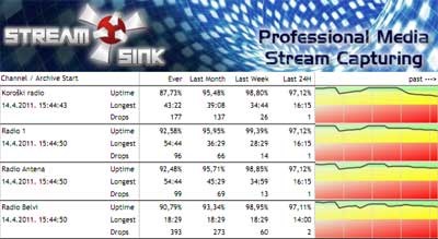
StreamSink has a integrated feature that is called ‘archive report’, that has data similar to what I need, but with it I would only get limited information. You can see the report here:
Most useful info on the report in this particular situation would be the graph on the right side of the report. Nike Air Max 2016 Heren wit Let me explain…
For each day StreamSink is able to record up to 24 hours of media. Fjallraven d’Occasion Due to network situations, it sometimes is less then 24 hours, and I decided that I would present that number in the form of percentage that archive is covered for the day. As you can see from the report, that percentage is shown for the whole archive lifetime, for last month, last week and last 24 hours.
Also, it is shown in the form of graph, where on the leftmost part of the graph is the current day, and as we go to the right, we sink onto the past, having divider lines at each 7 days. air max 1 pas cher Nice, eh? ![]()
But, as nice as that report is, I can’t read what 7 days and what channels are to be scanned – I have to find another way in.
Solution (at last)
For this one, I picked something that I learned from the above mentioned report. Cheap Fjallraven Kanken Outlet That was:
- I will have a channel list
- I will have some sort of calendar
- I have to see how much is covered for the archive for each day
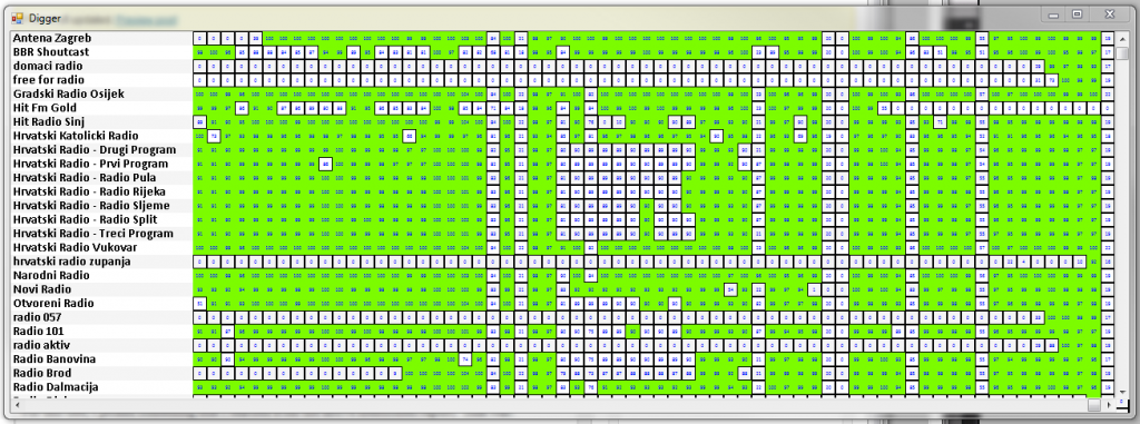
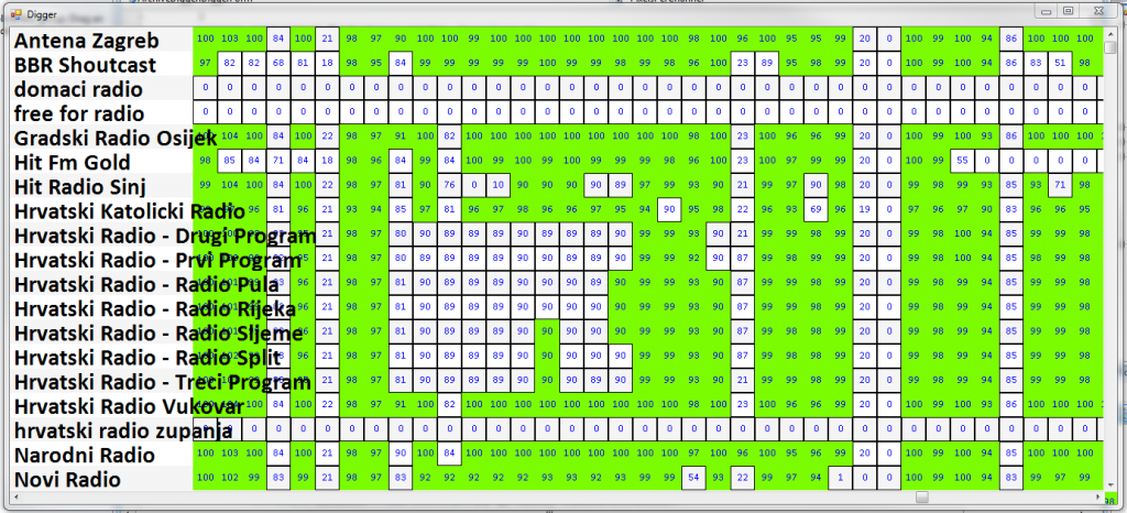
Also I decided to show each day as a cell in a table-style matrix, where rows would be occupied by channels, and columns will be days. Time flow was inverted here, so left is past, and right is the present.
Whole thing looks like this:
Same thing little zoomed in:
Note: green is the color for the days that have 90% or more archive covered.
At last, you can see from the both pictures that much of the data is revealed at the first glance. For example, 0 means that there were no archive that day at all. Nike Max Shoes UK Numbers below 90 suggest that either it was some problem with the channel that day, or StreamSink was either started or stopped in the middle of the day.
I could even color-code that information on the chart – but the utility will be expanded further only if there’ll be demand for it, since I know what I needed to know, from it.
BTW, I don’t want to brag here, but to code that utility it took 2-3 hours of thinking and coding, and almost no debugging.
Tags: archive, coding, playkontrol, reports, streamsink


